The Asymptotes of Power
Shimshon Bichler and Jonathan Nitzan [1]
Jerusalem and Montreal, February 2012
Revised transcript of a presentation by Jonathan Nitzan
The 2nd Annual Conference of the Forum on Capital as Power
The Capitalist Mode of Power: Past, Present, Future
October 20-21, 2011, York University, Toronto
Conference Page: www.bnarchives.net/320
Introduction
My presentation today is a follow-up to a talk I delivered last year at the 2010 inaugural conference of the Forum on Capital as Power. Both presentations are part of my joint research with Shimshon Bichler on the current crisis. Last year, my purpose was to characterize this crisis. I argued that it was a ‘systemic crisis’, and that capitalists were gripped by ‘systemic fear’. This year, my goal is to explore why.[2]
Begin with systemic fear. This fear, we argue, concerns the very existence of capitalism. It causes capitalists to shift their attention from the day-to-day movements of capitalism to its very foundations. It makes them worry not about the short-term ups and downs of growth, employment and profit, but about ‘losing their grip’. It forces on them the realization that their system is not eternal, and that it may not survive – at least not in its current form.
Last year, many in the audience found these claims strange, if not preposterous. Capitalism was obviously in trouble, they conceded. But the crisis, though deep, was by no means systemic. It threatened neither the existence of capitalism nor the confidence of capitalists in their power to rule it. To argue that capitalists were losing their grip was frivolous.
That was twelve months ago.
Nowadays, the notions of systemic fear and systemic crisis are no longer farfetched. In fact, they seem to have become commonplace. Public figures – from dominant capitalists and corporate executives, to Nobel laureates and finance ministers, to journalists and TV hosts – know to warn us that the ‘system is at risk’, and that if we fail to do something about it, we may face the ‘end of the world as we know it’.
There is, of course, much disagreement on why the system is at risk. The explanations span the full ideological spectrum – from the far right, to the liberal, to the Keynesian, to the far left. Some blame the crisis on too much government and over-regulation, while others say we don’t have enough of those things. There are those who speak of speculation and bubbles, while others point to faltering fundamentals. Some blame the excessive increase in debt, while others quote credit shortages and a seized-up financial system. There are those who single out weaknesses in particular sectors or countries, while others emphasize the role of global mismatches and imbalances. Some analysts see the root cause in insufficient demand, whereas others feel that demand is excessive. While for some the curse of our time is greedy capitalists, for others it is the entitlements of the underlying population. The list goes on.
But the disagreement is mostly on the surface. Stripped of their technical details and political inclinations, all existing explanations share two common foundations: (1) they all adhere to the two dualities of political economy: the duality of ‘politics vs. economics’ and the duality within economics of ‘real vs. nominal’; and (2) they all look backward, not forward.
As a consequence of these common foundations, all existing explanations, regardless of their orientation, seem to agree on the following three points:
1. The essence of the current crisis is ‘economic’: politics certainly plays a role (good or bad, depending on the particular ideological viewpoint), but the root cause lies in the economy.
2. The crisis is amplified by a mismatch between the ‘real’ and ‘nominal’ aspects of the economy: the real processes of production and consumption point in the negative direction, and these negative developments are further aggravated by the undue inflation and deflation of nominal financial bubbles whose unsynchronized expansion and contraction make a bad situation worse.
3. The crisis is rooted in our past sins. For a long time now, we have allowed things to deteriorate: we’ve let the ‘real economy’ weaken, the ‘bubbles of finance’ inflate and the ‘distortions of politics’ pile up; in doing so, we have committed the cardinal sin of undermining the growth of the economy and the accumulation of capital; and since, according to the priests of economics, sinners must pay for their evil deeds, there is no way for us to escape the punishment we justly deserve – the systemic crisis.
What if?
But, then, what if these foundational assumptions are wrong?
Liberals and Marxists view capitalism as a mode of production and consumption, and it is this view that determines the assumptions they make, the questions they ask and the answers they give. Now, what would happen if we departed from their view? How would our assumptions, questions and answers change if, instead of a mode of production and consumption, we thought of capitalism as a mode of power?[3]
The short answer is that they would change radically. The bifurcation of ‘economics’ and ‘politics’ would become untenable, thereby rendering the notion of economic crisis meaningless. The separation of the ‘real’ and the ‘nominal’ would become unworkable, thereby leaving finance with nothing to match or mismatch. And the backward-looking orientation of the analysis would have to give way to a forward-looking stance, rooting the crisis not in the sins of the past but in the misgivings of the future.
Our simple ‘what-if’ question – and the radical ramifications it carries – is not unlike the ones raised by Copernicus, Spinoza and Darwin, among others.
They too questioned the old assumptions: ‘What if the sun rather than the earth is at the centre?’ asked Copernicus. ‘What if religion was created not by God, but by mere mortals who use it to impose their power on other mortals?’ asked Spinoza. ‘What if humans weren’t created by the Almighty, but evolved from other living creatures?’ asked Darwin.
And they too tried to provide answers. Their answers may have been tentative, incomplete or even wrong – but these shortcomings are entirely secondary. The important thing is that they asked the questions in the first place. They started from scratch. Their questions went to the very root, and this radical departure altered the entire orientation: it opened up the horizon, led to totally new findings and eventually culminated in entirely new frameworks.
The current systemic crisis offers a similar Ctrl-Alt-Del opportunity. By casting doubt on the conventional creed, it opens the door to fundamental questions: questions about what capitalism is, how it should be analyzed and to what end.
So let’s hit the keys. Instead of consumption and production, the framework Bichler and I offer focuses on power.[4] In our framework, capital is power, and more specifically, forward-looking power. When capitalists expect their power to increase, capitalization rises: more power equals positive accumulation. And when the outlook inverts and capitalists expect their power to decrease, accumulation goes into reverse: less power equals decumulation.
From this viewpoint, an ordinary capitalist crisis means that capitalists expect a significant decrease in their power – but that they also expect their power to recover eventually. By contrast, a systemic crisis means that capitalists fear that their power is about to drop precipitously, or even disintegrate, and that this disintegration might be irreversible – at least within the existing parameters of capitalism.
Pending Collapse
The relevant question for us today concerns the latter type of crisis: when are capitalists likely to expect their entire system of power to collapse, and what conditions may trigger such a drastic change in outlook?
Because we are dealing here not only with historical conditions, but also with capitalist expectations regarding the future development of those conditions, it is not easy to answer this question. However, there are certain extreme situations in which the answer becomes more apparent, and these situations are described by the title of my talk: capitalists are most likely to expect their power to fall precipitously or disintegrate when this power approaches its asymptote.
Mathematicians use the term ‘asymptote’ to denote a quantitative limit, something like a ‘ceiling’ or a ‘floor’ that a curve approaches but never quite reaches. And the same term can be used to describe the limits of power.
Capitalist power rarely if ever reaches its upper limit. The reason can be explained in reference to the following dialectical interplay: the closer power gets to this limit, the greater the resistance it elicits; the greater the resistance, the more difficult it is for those who hold power to increase it further; the more difficult it is to increase power, the greater the need for force and sabotage; and the more force and sabotage, the higher the likelihood of a serious backlash, followed by a decline or even disintegration of power.[5]
It is at this latter point, when power approaches its asymptotes, that capitalists are likely to be struck by systemic fear – the fear that the power structure itself is about to cave in. And it is at this critical point, when capitalists fear for the very survival of their system, that their forward-looking capitalization is most likely to collapse.
The Argument
Our claim in this presentation is that the systemic fear that currently grips capitalists is well grounded in the concrete facts.
The problem that capitalists face today, we argue, is not that their power has withered, but, on the contrary, that their power has increased. Indeed, not only has their power increased, it has increased by so much that it might be approaching its asymptote. And since capitalists look not backward to the past but forward to the future, they have good reason to fear that, from now on, the most likely trajectory of this power will be not up, but down.
Before fleshing out this argument, though, a few words about the method and structure of the presentation. Our analysis here is limited to the United States, but this limitation isn’t really a drawback. The chief purpose of this analysis is methodological. For us, the important question is how we should study capitalist power – and in this respect the United States may offer the best starting point. First, although the global importance of U.S. capitalism may have diminished over the past half century, its recent history is still central for understanding the dynamics of contemporary capitalist power. And second, to answer the kind of questions that we’ll be asking requires detailed data that are not readily available for many other countries.
With this emphasis in mind, I will begin by setting up our general framework and key concepts. I will continue with a step-by-step deconstruction of key power processes in the United States, attempting to assess how close these processes are to their asymptotes. And I will conclude with brief observations about what may lie ahead.
Major Bear Markets
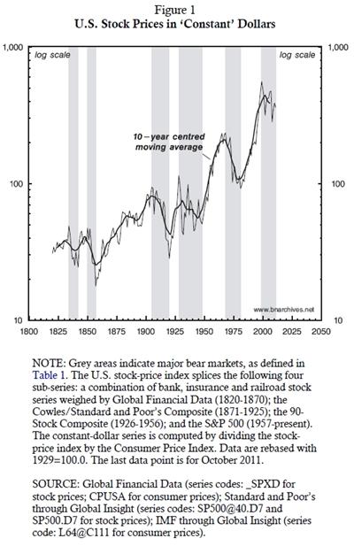
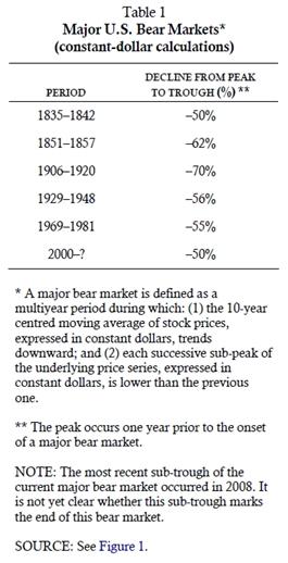
Let’s start with the context. Figure 1 and Table 1 portray the history of U.S. capitalism as seen from the viewpoint of capitalists. The ultimate interest of capitalists is capitalization: the forward-looking value of their assets. And the main yardstick for that value is the stock market.
Figure 1 shows the history of U.S. stock prices. On the stock market, prices are denominated in actual dollars and cents. However, ‘nominal’ measures can be affected greatly by the ups and downs of the general price level, so economists like to divide, or ‘deflate’, them by the consumer price index in order to obtain what they call a ‘constant dollar’ measure. And that is what we do in Figure 1: we show the stock-price index without the effect of inflation.
As you can see, the overall historical trend of stock prices is up. You can also see, though, that this uptrend is fractured by periods of sharp declines of 50-70 per cent, marked by the shaded areas. These shaded areas denote what we call ‘major bear markets’, whose definition is given in Table 1.
Contemporary critiques of capitalism often dismiss such charts as a fetish of ‘finance’. The magnitudes of finance, they say, are no more than fictitious symbols. They distort the ‘real’ nature of capital and mislead us into the wrong conclusions. In our view, though, this fashionable dismissal is wrongheaded. The stock market is not only the central barometer of modern capitalism; it is also the key power algorithm through which capitalists creorder – or create the order – of their world.
To illustrate this point, consider the last four major bear markets. Each of these periods signalled a major creordering of capitalist power.
1. The bear market of 1906-1920 marked the closing of the American frontier and the shift from robber-baron capitalism to large-scale business enterprise and the beginning of synchronized finance.
2. The crisis of 1929–1948 signalled the end of ‘unregulated’ capitalism and the emergence of large governments and the welfare-warfare state.
3. The crisis of 1969–1981 marked the closing of the Keynesian era, the resumption of worldwide capital flows and the onset of neoliberal globalization.
4. And the current crisis – which began not in 2008, but in 2000, and is still ongoing – seems to mark yet another shift toward a different form of capitalist power, or perhaps a shift away from capitalist power altogether.
What is the nature of the current crisis? How is this crisis related to capitalist power? And what are the asymptotes of that power?
Capital as Power
The best place to begin is Johannes Kepler, one of the key architects of the mechanical worldview. Prior to Kepler, force (or power) had two principal features: it was thought of as an entity in and of itself, on a par with the elements; and it was conceived of qualitatively, not quantitatively. Kepler inverted this view. In his method, force is not a stand-alone entity, but a relationship between entities; in other words, it is not absolute but differential. And this relationship is not qualitative, but quantitative.[6]
Modern science adopted Kepler’s approach, and in our view the same approach should be applied to capital. Thus, when we say that capital is power, we mean: (1) that capital is not an entity in its own right, but a differential relationship between social entities; and (2) that this relationship is quantitative, measured in monetary units. Let’s examine these two features more closely, beginning with the quantitative dimension.
The Quantitative Dimension: Capitalization
Equations 1 to 5 deconstruct the basic concept of modern capitalism: the algorithm of capitalization. This concept was invented in the Italian city states, probably during the fourteenth century or even earlier; but it was only at the turn of the twentieth century that it developed into the dominant power algorithm of capitalism.[7]
The gist of capitalization is spelled out in the first line of Equation 1. In this line, the price of a corporate stock – or any other asset, for that matter – is given by the earnings the asset is expected to generate (in this case, the expected earnings per share, or eps), divided by the discount rate.
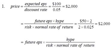
For instance, if the expected eps is $100 and the discount rate is 5 per cent, the asset would be capitalized at $2,000. This result is easy to verify by going in reverse: divide $100 of earnings per share by an initial investment of $2,000, and you’ll get the discount rate of 5 per cent.
The second line of Equation 1 decomposes each element. In the numerator, expected eps is the future eps (whose magnitude will become known in the future) times the hype coefficient of capitalists. In the example here, the future eps is $50. But capitalists are overly optimistic, with a hype coefficient of 2. This hype means that they expect the future eps to be $100, or twice its eventual level. As a rule, hype is greater than 1 when capitalists are overly optimistic and smaller than 1 when they are overly pessimistic.
Looking at the denominator, we can express the discount rate as the product of the normal rate of return and the risk coefficient. In our example here, the normal rate of return is 2.5 per cent; but this is a risky stock, with a risk factor of 2. If we multiply this 2.5 per cent by 2, we get the discount rate of 5 per cent.
So all in all, capitalization comprises four elementary particles: (1) future eps, (2) hype, (3) risk, and (4) the normal rate of return.
Now, for the purpose of the empirical illustration that follows, it is useful to build a link between future and present earnings. At any point in time, future eps can be written as a multiple of current eps (henceforth eps) and a scalar m, whose magnitude will become known in retrospect, after the future earnings are incurred:
![]()
Substituting this expression back into Equation 1, we get:
![]()
Dividing both sides of Equation 3 by eps, we get the pe ratio, or the ratio of price to (current) earnings:
![]()
Substituting the pe ratio for the two last elements of Equation 3, we get:
![]()
So as a shorthand, we can always decompose the price of a stock into two components, as shown in Equation 5: the eps and the pe ratio (which accounts for the remaining elementary particles of the capitalization algorithm and the scalar m).
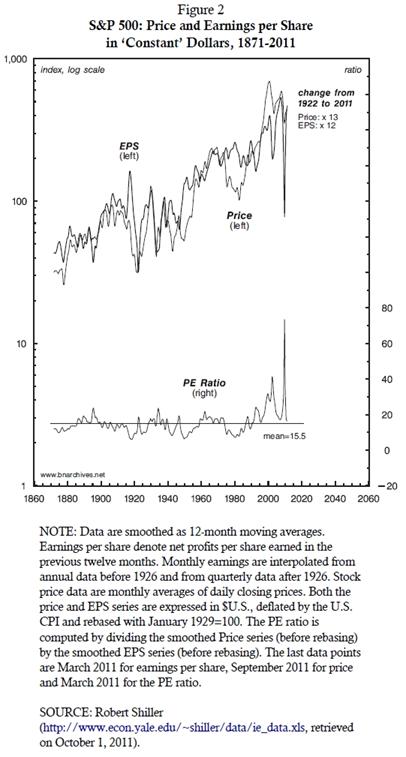
The reason for this decomposition is made apparent in Figure 2. The chart shows the history of price and eps for the S&P500, an index that comprises the largest U.S.-listed companies, ranked by market capitalization. Both the eps and price series are expressed in ‘constant dollars’, and both are plotted on the left log scale. The bottom of the chart plots the pe ratio against the right arithmetic scale.
Recalling that price = eps × pe, we can now appreciate the effect on price of each of the two right-hand components. The bottom of the chart shows that the combined effect of hype, risk, the normal rate of return and the scalar m, measured by the pe ratio, is cyclical. Historically, this effect oscillates up and down around a mean value of 15.5. By contrast, the effect of eps is secular. To illustrate this latter fact, note that, between 1922 and 2011, the price series grew by a factor of 13 – and that much of this growth was accounted for by the rise of eps – which rose by a factor of 12 (and probably more, since the most recent eps observations are not yet available).
This decomposition should help us focus our exposition. A power analysis of capitalization comprises all of its elementary particles. But as Figure 2 makes clear, over the long haul the most important of these elementary particles is earnings, and that is what we’ll concentrate on today.
The Relational Dimension: Distribution and Redistributon
Now, recall that for Kepler, power is not only quantitative, but also relational. It is not a stand-alone entity, but a relationship between entities. So if capital is power, its analysis should be relational rather than absolute.
Capitalism is a system of privately owned commodities, a social order where ownership is quantified through prices. To understand the power dynamics of this system, we need to understand the way in which relative prices change over time; in other words, we need to understand distribution and redistribution.
Let us start with a hypothetical situation in which capitalist power remains unaltered: there is no redistribution, and the underlying price relationship is unchanged. To illustrate this situation, assume that corporate profits amount to 2 per cent of national income. If capitalist power remains unaltered, this ratio will not change. National income may rise and fall; but since power stays unchanged, profits will rise and fall at the same rate, leaving the profit share stable at 2 per cent.
Of course, this stability is rarely if ever observed in practice. Capitalists are compelled to try to increase their power, and the power struggle that ensues makes the share of profit in national income change over time.
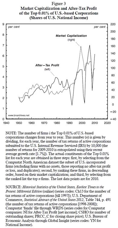
This ongoing change is evident in Figure 3. The figure plots data for dominant capital, approximated here by the top 0.01 per cent of all U.S.-based corporations ranked by market capitalization (henceforth the Top 0.01%).[8] The thin series, plotted against the right scale, shows the equity market capitalization of the Top 0.01% expressed as a per cent of U.S. national income. The thick series, plotted against the left scale, shows the after-tax profit of the Top 0.01% as a share of national income.[9]
Now, if we were to freeze capitalist power relative to the power of all other social groups at the level it was at in 1950, both series would look like horizontal lines. Since all groups, including capitalists, would retain their relative power, the prices of their respective commodity bundles would change at the same rate, and the ratios of these prices would remain unchanged.
But that is not what we observe in the graph. Instead, we see ongoing changes in both series, meaning that the structure of power has been constantly creordered. Moreover, the changes seem anything but random. As the figure makes clear, both series have trended upward. The ratio of market capitalization of the Top 0.01% to national income increased eightfold – from 20 per cent in the early 1950s to 160 per cent in the early 2000s, before dropping to 100 per cent in 2010. And the after-tax profit share of the Top 0.01% in national income rose threefold – from 2 to 6 per cent over the same period.
The patterns depicted in Figure 3 carry three related implications. First, they indicate that, contrary to what many economists would have us believe, much of the stock-market boom of the 1990s was due not to ‘economic growth’ or ‘solid fundaments’, but to a major redistribution of power in favour of dominant capitalists. Second, the patterns make it difficult to attribute the current crisis to waning capitalist power: if anything, this power – measured by the profit share of the Top 0.01% in national income – has increased, and it remains at record levels despite the ongoing crisis. Third and finally, the patterns suggest that dominant capitalists now realize that that their record profit-share-read-power has become unsustainable, hence the 10-year collapse of their forward-looking capitalization.
The question we need to address, then, is twofold. First, what caused capitalist power to increase over the past half century, and particularly over the last twenty years? And second, looking forward, what are the limits on that power; or in terms of the title of the paper, how close is capitalist power to its own asymptote?
Asymptotes of Power
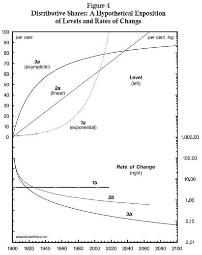
One important feature of distributional power is that it clearly bounded. Given that no group of capitalists can ever own more than there is to own in society, distributional power can never exceed 100 per cent. Similarly, since no owner can own less than nothing, distributional power cannot fall below 0 per cent.[10] The movement between these lower and upper bounds, though, can follow many different patterns.
Three such patterns are illustrated in Figure 4. The patterns themselves are generated by mathematical functions, but we can easily endow them with concrete social meaning. Assume that each of the lines 1a, 2a and 3a at the upper part of the figure (plotted against the left scale) represents a particular trajectory of the after-tax profit share of the Top 0.01% in national income, and that each of the lines 1b, 2b and 3b at the bottom (plotted against the right logarithmic scale) represents the corresponding rate of change for that trajectory.[11]
The chronological starting point in our hypothetical illustration is the year 1900, in which all three lines show an after-tax profit share of around 1 per cent. From this point onward, the patterns diverge. Line 1a, for example, shows the result of a constant, 4-per-cent growth rate per annum. This growth rate increases the after-tax profit share to 1.04 per cent in 1901, to 1.082 in 1902, to 1.125 in 1903, and so on. Since the after-tax profit share grows at an unchanging rate, the corresponding growth-rate series 1b at the lower part of the chart is a flat line. The after-tax profit share rises exponentially, and sometime before 2020 it reaches 100 per cent of national income. This is the ‘glass ceiling’. From this point onward, the share can no longer increase: it either stays the same or drops. (In this figure, we left it unchanged at 100 per cent; notice that once line 1a at the top hits the glass ceiling, line 1b at the bottom, representing the growth rate, gets ‘truncated’, since the growth rate drops to zero.)
Now, capitalists operate against the opposition of non-capitalists (as well as of other capitalists). In order to earn profits, they need to exert enough power to overcome this resistance. As we noted earlier, though, the resistance itself is not fixed: it tends to increase as the income share of capitalists rises while the income share of others shrinks. And this growing resistance means that the higher the profit share of the capitalists, the greater the power they need to exert in order to make it even bigger.
These power relations can be traced in Figure 4. The lines at the top, denoting the after-tax profit share of income of the Top 0.01%, represent the power of dominant capital operating against resistance, while the lines at the bottom show the rate at which this profit-share-read-power changes over time.
In terms of our first example, line 1a shows capitalist power growing exponentially. It trumps the opposition at an annual rate of 4 per cent (line 1b), until the resistance is totally crushed and capitalists appropriate the entire national income. The end result itself is socially impossible (the non-capitalists, having lost their income, perish) or non-capitalistic (the losers end up living on handouts from the winners; see footnote 5). But the pattern of accelerating power leading toward that end is certainly possible, at least over a limited period of time.
Another hypothetical illustration is given by lines 2a and 2b. Here, too, we see capitalist power rising, but resistance to that power rises as well. And as a result, the growth rate of this power declines: at the beginning of the process, during the early 1900s, the rate of growth is 100 per cent per annum; by the 1950s it falls to about 2 per cent; and by the end of the twentieth century it declines to 1 per cent. However, mounting resistance isn’t enough to stop the increase in capitalist power, and sometime during the 2060s capitalists end up appropriating the entire national income. As in the previous example, from this point onward capitalist power can either remain unchanged or drop. And although the end outcome itself, as before, is socially impossible or non-capitalistic, the pattern of linearly growing power that leads to that outcome is perfectly plausible.
The last pattern, which we label ‘asymptotic’, is illustrated by lines 3a and 3b. Initially, the share of profit increases rapidly, but the growth rate tapers off very quickly. Unlike in the previous two cases, in this one resistance grows too fast for capitalists to trump it completely. And, as a result, although the profit share rises, it never reaches the 100 per cent ceiling. It merely approaches it asymptotically.
Now remember that these lines are no more than ideal types that illustrate alternative patterns. In practice, the profit share is never that stylized: it goes up or down, it fluctuates around its own trend and its asymptote need not be 100 per cent – or any other particular level, for that matter. It can be anything. As we shall soon see with the actual data, the hypothetical patterns illustrated here combine to produce ragged and occasionally wave-like trajectories of various durations. These trajectories show power increasing at various rates, receding, rising again, approaching its asymptote, and occasionally collapsing.
The key point, though, is that these patterns of distribution and redistribution, whatever they may be, quantify underlying power processes. And this quantification of power makes distributional patterns – and the limits embedded in them – crucial for understanding capital accumulation and capitalist development.
Much of my work with Bichler over the past three decades has been concerned with making sense of such historical patterns. Often, the oscillations represent variations in power with a given order. But occasionally, they point to deeply transformative moments, ones that creorder the entire mode of power. One example of such creordering is the relationship between differential oil profits and energy conflicts in the Middle East (Nitzan and Bichler 1995; Bichler and Nitzan 1996). Another example is the regime pattern of differential accumulation, where dominant capital oscillates between breadth and depth as it breaks through its successive social envelopes (Nitzan 2001; Nitzan and Bichler 2001). And a third illustration is the relationship between major bear markets shown in Figure 1 and Table 1 and the corresponding transmutations of the capitalist mode of power that accompany them (Bichler and Nitzan 2008).
My presentation today is nested in this latter relationship. Focusing on the most recent and still ongoing major bear market, my purpose is to identify the power underpinnings of the crisis, to assess the limits imposed on them and to speculate on what those limits may imply for the near future of the capitalist mode of power.
National Income Shares
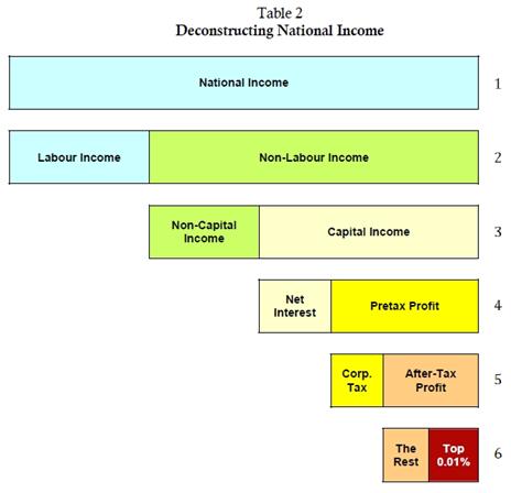
The next step in this journey is to unpack the statistical category of ‘national income’. Table 2 shows the underlying components of this aggregate. Note that the table is not drawn to scale. Our concern at this point is merely the relationship between the different components, not their relative size.
Line 1 is national income. This line represents the total income, measured in dollars and cents, earned in a society during a given year. Line 2 shows that national income comprises two sub-categories: labour and non-labour income. In line 3, we see that non-labour income consists of two components: the income of capitalists and the income of non-capitalists other than employees (i.e. proprietors, rentiers and the government). Line 4 shows that capitalist income includes two types of income: net interest and pretax profit. Line 5 shows that pretax profit consists of corporate taxes that go to the government and after-tax profit that belongs to the capitalists. Finally, in line 6 we see that after-tax profit can be broken down to the profit of the Top 0.01% and the profit of all other firms.
This structure offers a guideline on how to investigate the redistribution of power.[12]
Recall our starting point. In Figure 3, we saw that the stock-market boom of the 1990s was underwritten not by ‘economic growth’, but by a massive creordering of power: a redistributional process in which the Top 0.01% managed to more than double its after-tax profit share in national income. The figure also showed that the crisis of the past ten years has been unfolding with capitalist power hovering around historic highs. These observations, along with the forward-looking outlook of capitalists, suggest that the current crisis may be the result of capitalists becoming not weaker, but stronger; and that capitalist power may be approaching its social asymptote – a level too high to sustain, let alone increase.
At this point, then, the question we need to ask is twofold. First, what were the concrete power processes that made this massive redistribution of income possible in the first place? And, second, what might be the specific limits on this power to redistribute?
The remainder of the presentation tries to answer these questions by looking at the following nested transformations. Note that, all else remaining the same, each of these transformations works in favour of the Top 0.01%:
• Within national income, the shift from labour to non-labour income (line 2 in Table 2).
• Within non-labour income, the shift from non-capital to capital income (line 3).
• Within capital income, the shift from net interest to pretax profit (line 4).
• Within pretax profit, the shift from corporate tax to after-tax profit (line 5).
• Within after-tax profit, the shift of after-tax profit from smaller firms to the Top 0.01% (line 6).
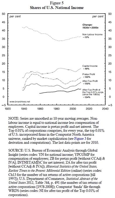
Figure 5 provides a bird’s-eye summary of these transformations, tracing the historical trajectories of the various national income shares since the 1930s (note that the data are expressed as 10-year moving averages, so every observation denotes the average of the preceding ten years). The chart shows that, despite having risen since the early 1980s, the share of non-labour income remains 13 per cent below what it was in the 1930s. However, the chart also shows that, within non-labour income, the above-listed shifts have been positive and large: the national income share of capital income increased by 48 per cent; of pretax and after-tax profit by 120 per cent; and of the after-tax profit of the Top 0.01% by 134 per cent (the last increase is measured since the 1950s). Let us now turn to a closer examination of each of these processes.
Components of National Income
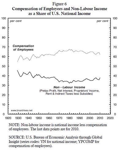
Figure 6 provides the most basic breakdown of national income, between labour and non-labour income. The chart tells the quantitative history of line 2 in Table 2 – and on the face of it, the story doesn’t seem too fascinating.
We can see that compensation of employees, expressed as a share of national income, rose from a low of 54 per cent in 1929 to a high of 68 per cent in 1980, and that from then onward it declined gradually, reaching 62 per cent in 2010. As expected, this gradual shift is mirrored by the movement of non-labour income, whose share of national income declined from the 1930s to the early 1980s and rose thereafter.
Now, a naïve assessment of this process may lead one to conclude that the rising share of non-labour income has much more room to go. Even after a three-decade decrease, labour income still amounts to nearly two-thirds of national income. Moreover, this share remains higher than it was in the early part of the century, and that fact suggests that it could be squeezed further in favour groups other than workers, including the Top 0.01%.
But that would be a hasty conclusion to draw. In fact, looking forward, squeezing the share of labour income further is bound to prove difficult.
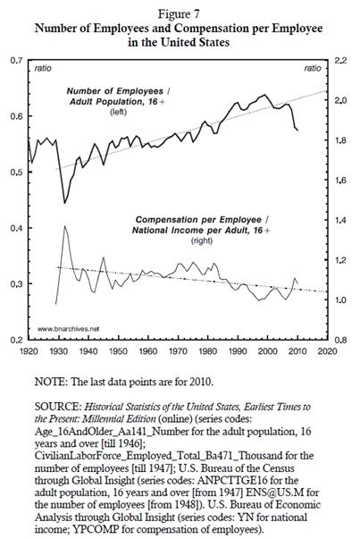
This statement may seem counterintuitive, but the reasons behind it could be explained with a simple decomposition. Consider Equation 6, whose final line expresses the share of employees in national income as a product of two distinct factors: (1) the share of employees in the total adult population, and (2) the ratio between compensation per employee and the national income per adult. The first factor gauges the number of employees relative to all potential employees. The second factor contrasts the average income of an employee with the average income generated by the adult population as a whole.
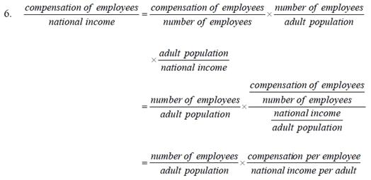
The historical data for these two components are plotted in Figure 7, and, unlike in Figure 6, here the picture is very interesting.
Note that labour income can be redistributed in favour of other groups in one of two ways. The first method is to convert workers into capitalists or proprietors of various sorts, and in so doing re-designate their income. In this way, what was once called a wage becomes profit, interest, rent, entrepreneurial income, etc. – all depending on the new identity of the former worker. But as the top series in the chart shows, historically the conversion has gone the other way: over the past century or so, a growing share of the adult population has been compelled to become workers.
The second method is to squeeze the average income of workers, and in so doing increase the income of non-workers. According to the trend depicted in the bottom series, this is exactly what has happened since the 1930s: the average worker’s income, measured relative to the national income per adult, has gone down.[13]
Is this relative downtrend ‘sustainable’? Between the 1970s and the early 2000s, employee compensation relative to national income per adult fell by about 17 per cent; can this ratio be squeezed by another 17 per cent in the next 30 years?
The answer is probably positive: relative wages can be reduced further. But given that this measure is already low by historical standards, squeezing it further is likely to prove increasing difficult. It will require greater threats, larger doses of violence and the incitement of more fear. And since a greater exertion of power invites greater resistance, there is also the prospect of a powerful backlash. So all in all, it seems that the power of capitalists relative to employees is much closer to its asymptotes than Figure 6 would otherwise imply.
Components of Non-Labour Income
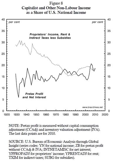
The next step in our decomposition is depicted in Figure 8, which drills deeper into non-labour income. Following line 3 in Table 2, Figure 8 decomposes non-labour income into two components. The first component, depicted by the thick series, is the income of capitalists, comprising pretax profit and net interest.[14] The second component, depicted by the thin series, measures the income of those who are neither workers nor capitalists – namely proprietors, rentiers and the government.
The figure shows that, over the past century, there has been a significant redistribution from those who are neither workers nor capitalists to capitalists: capitalists’ share in national income has risen to roughly 20 per cent, up from 12 per cent in the 1930s, while the share of non-workers/non-capitalists has fallen to 20 per cent, down from 30 per cent.
Can this pro-capitalist redistribution continue? Sure it can. But as we have seen in the case of employees, here, too, the process is likely to prove increasingly difficult to continue.
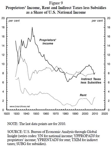
To better understand the particular limitation here, consider Figure 9. The chart shows the three ingredients of non-capitalist income. The dashed series represents government sales and import taxes, net of government subsidies. This net claim has remained at roughly 8 per cent of national income, and given the U.S. government’s regressive bias and need for tax income, reductions in this share are not very likely.
The thin series in the figure is rent – including the amounts actually paid by tenants to landlords, as well as those imputed to people living in their own homes. This component of national income had been in a free fall till the 1980s and is now so low that a further reduction – even if it were achievable – would add little to capitalist income.
The only significant candidates for an additional redistributional squeeze here are the proprietors. It is true that their share of national income has already been squeezed from 18 per cent in the 1940s to 8 per cent presently, but that latter proportion is still sizeable. Can it be reduced further?
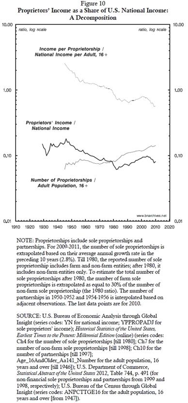
To see the potential for this further redistribution, consider Figure 10. This chart decomposes the proprietors’ income share in a manner similar to the decomposition of the wage share in Figure 7 (note that here we use a log scale and that the income shares are expressed in decimals rather than as percentages). The thick series in the chart is taken from Figure 9 to contextualize the process. The thin series shows the ratio between the number of proprietorships and the adult population.[15] And the dashed series shows the ratio between the average income per proprietorship and the average national income per adult. If you were to multiply the values of the thin and dashed series, you would get the values of the thick one – the decimal share of national income received by proprietors.
The redistributional process here is very similar to – albeit much more dramatic than – the one we saw with wages. In principle, capitalist income can be increased by turning proprietors into capitalists and reclassifying their income as interest or profit. But according to the thin series in Figure 10, the process has unfolded in the opposite direction: since the 1940s – and particularly since the free-enterprise revolution and union busting of the 1980s – an ever growing proportion of the adult population has been forced to join the ranks of the proprietors. And if we are to judge by the relative income of these proprietors indicated by the dashed series, the newcomers have been in for a pretty rough ride.
During the 1940s, the relative income of proprietorships was three times the national income per adult; by the early 2010s, it dropped to one half – a six-fold decrease. In other words, capitalists cannot bank on squeezing proprietors much further: these proprietors already earn half as much as the average employee, so compressing their income even further will likely reduce them to something close to bare subsistence.
So here, too, capitalist power seems to be pushing against its own asymptotes: it can be increased a bit more – but only with plenty of violence and a lot of downside risk.
Components of Capitalist Income
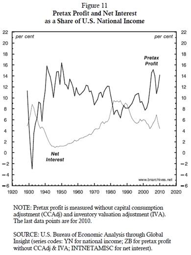
The next step, illustrated in Figure 11, is to decompose capital income into pretax profit and net interest. Before turning to the data, though, a couple of qualifiers are in order.
First, our analysis here is concerned primarily with profit, so the distinction we make between profit and interest is certainly relevant. However, we should also note that, contrary to the conventional creed, this distinction has nothing to do with the common separation between so-called ‘non-financial’ and ‘financial’ activities. Both profit and net interest are payments that businesses make to their owners: the former payment is made to owners of equity, the latter to owners of debt, and that is it. Moreover, all firms – whether they are labelled ‘non-financial’ (and by implication ‘productive’) or ‘financial’ (and therefore ‘unproductive’) – make both types of payments to their owners/creditors.
Second, and although it may sound strange, in the national accounts home ownership is considered an ‘enterprise’. Because owning a home is the only ‘enterprise’ that pays but does not receive interest, interest on home mortgages, although paid by individuals (to firms), ends up as part of the net interest payments to individuals (i.e., the interest paid by less the interest received from enterprises).
As Figure 11 makes clear, variations of net interest have an important effect on pretax profit. We have already seen in Figure 8 that the overall share of capital in national income has trended upward. But here we can see that the components of capital income tend to move in opposite directions: when the share of interest in national income declines, the share of profit in national income rises – and vice versa. And the reason is simple: all else being equal, the lower the interest payments to debt owners, the more there remains for equity holders. (As a side note, this pattern suggests that variations in the profit share of national income may owe more to the accounting classification of capitalist income than to the ‘class struggle’ between capitalist and workers.)
Now, a corporate strategist inspecting Figure 11 with an eye to the future may ask: how far can this twin process of falling net interest and rising pretax profit go? And his short answer would probably be: not very far.
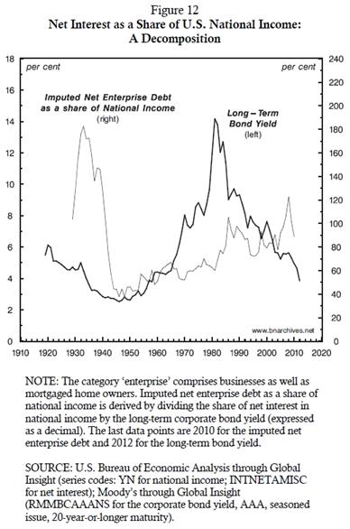
The reason for this answer is outlined in Figure 12. To make sense of this chart, note that the amount of net interest paid is always a product of two components: the amount of outstanding debt and the rate of interest. The components of this product are easy to impute. If we take from Figure 11 our measure of net interest as a share of national income and divide it by the rate of interest, we get an estimate of the net debt of enterprises, expressed as a share of national income. The figure plots both of these components – the long-term bond yield (thick series against the left scale) and the imputed net debt of enterprises relative to national income (thin series against the right scale).[16]
Begin with the imputed net debt of enterprises. The chart shows how the value of this debt fell from nearly 200 per cent of national income in the 1930s to about 40 per cent in the 1940s (the initial part of the decline was probably driven by bankruptcies, and the subsequent decline by rising national income). By the late 1940s, however, the trend reversed: the ratio of debt to national income started to increase, and by the 2000s it reached 100 per cent.
Next, consider the rate of interest, measured here by the yield on AAA corporate bonds with 20-year-or-longer maturity. This rate increased from less than 3 per cent in the 1940s to 14 per cent in the 1980s, before dropping below 4 per cent in early 2012 – oscillations that owe much to the rise and decline of inflation.
Now, note that since the 1980s, the ratio of debt to national income and the rate of interest moved in opposite directions, but that the decline of the latter was faster than the rise of the former, causing the overall share of net interest in national income to decline.
What can we say about this process looking forward? A decline in outstanding debt is certainly possible – but such a decline, were it to occur, would likely be effected through a massive crisis that would also crush profit. Barring such a crisis, the likely trajectory is for the ratio of debt to national income to remain high or increase further.
In other words, any further decline in the share of net interest in national income has to come from lower interest rates. But since interest rates are already low by historical standards, the benefit for profits from such a reduction is bound to be limited. So here too we can see the asymptote.
Components of Corporate Profit
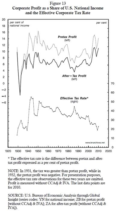
Now, this isn’t the end of the story. So far, we have dealt with pretax profit. But for capitalists, the pretax is just a means to an end. Their real goal is the ‘bottom line’: the profit they are left with after tax. And here we come to another very interesting part of the puzzle, illustrated in Figure 13.
The two series at the top, plotted against the left scale, are expressed as a share of national income: the thin series measures the share of pretax profit and the thick series the share of after-tax profit. Note that the cyclical ups and downs of the two series are very similar, but that their long-term trends are not. If we take the 2000s as our reference point, we can see that although both series have risen since the early 1980s, the national income share of pretax profit is still lower than it was during the 1940s and 1950s, whereas the income share of after-tax profit is higher.
The reason for this long-term divergence is explained by the bottom series, which plots the effective corporate tax rate against the right scale. The data show that during the 1920s and 1930s corporations hardly paid any corporate taxes. But the Great Depression and the reforms that followed ended this free ride, pushing the effective corporate tax rate from 20 to nearly 55 per cent. Obviously, this was a massive setback to the power of owners. It hammered after-tax profit more than anything else – but given the political climate of the time, corporations found it difficult to protest.
Capitalists, though, weren’t about to give up, and over the next seventy years, they have managed to claw back what they felt was rightly theirs. Their efforts were highly successful – so much so that by the early twenty-first century, the corporate tax rate is roughly the same as it was in the 1920s, before the welfare-warfare state had been conceived.
The impact of this reduction has been staggering: by having their corporate tax rate reduced from 55 to 20 per cent, owners have managed to boost their after-tax profit by 78 per cent. But, as we have seen, the greater the power – in this case, the power to not pay taxes – the harder it is to augment this power. The current political climate makes further corporate tax cuts difficult to achieve. And even if such reductions were to be implemented, their effect on the bottom line would be small. Given that the current effective corporate tax rate is only 20 per cent, the most capitalists could hope for is a 25 per cent increase in their after-tax profit – and that increase would require the elimination of corporate taxes altogether! So once again in our journey, we see capital as power approaching its asymptotes.
Components of After-Tax Profit
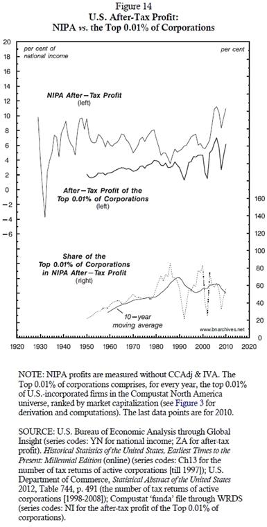
Guided by Table 2, we have one more step to consider, and that is the after-tax profit share of the Top 0.01%. This share is examined in Figure 14. The top part of the chart shows two series plotted against the left scale. The thin series is the share of total after-tax profit in national income (we call this the ‘NIPA’ series, to mark its relation to the national income and product accounts). The thick series is the net profit of the Top 0.01%, expressed as a share of national income (corporate reports commonly denote after-tax profit as ‘net profit’ or ‘net income’). The bottom of the figure shows another two series, plotted against the right scale. The dashed series is the ratio of the two top series: it expresses the share of the Top 0.01% in NIPA after-tax profit. The solid line going through this series expresses this ratio as a 10-year moving average to show the long-term trend.
The relation between total NIPA profit and the profit of the Top 0.01% serves to historicize the process of corporate centralization. As we can see from the bottom series, during the early 1950s the Top 0.01% accounted for slightly more than 20 per cent of total after-tax profit. Ongoing mergers and acquisitions pushed this share upward, to 85 per cent by the mid 1980s: at that point, the Top 0.01% appropriated nearly all of the national profit of the United States.
But that was the peak. Since then, the share of the Top 0.01% in NIPA after-tax profit has oscillated widely, but the overall trend is no longer up, but sideways, hovering around 60 per cent of the total.
This pattern may seem puzzling. Why did the after-tax profit share of the Top 0.01% stop growing in the early 1990s? What has halted the process of corporate centralization around 60 per cent? Can the leading U.S.-based corporations reignite the engine of centralization to increase their profit share further, or are they brushing up against their asymptote?
Rest of the World
Note that so far our framework has been limited to the ‘United States’ proper (abstracting from the ambiguities associated with this statist category). We have focused specifically on national income, dissecting the various components in which the net profit of the Top 0.01% is nested. However, both the aggregate after-tax profit of the NIPA and the net profit of the Top 0.01% are earned, at least in part, outside the United States – in what the statisticians call ROW (rest of the world).
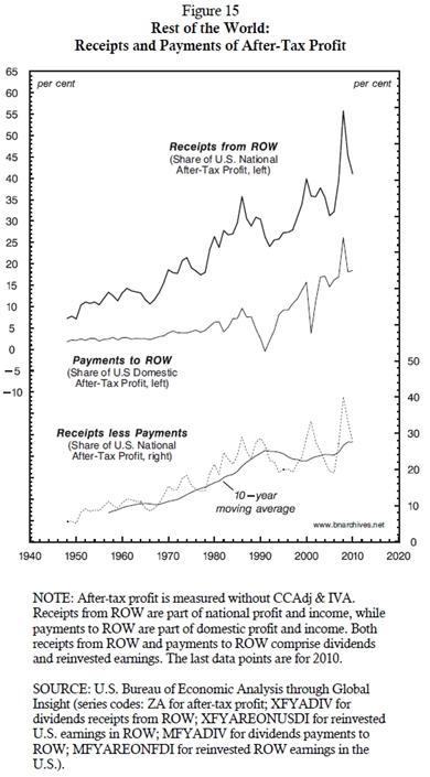
The growing importance of ROW profit is shown in Figure 15. The raw data that underlie this figure are fraught with hazards of estimation and interpretation, but the overall long-term trends they portray are probably valid.[17] The thick series at the upper part of the figure plots the proportion of U.S. after-tax profit (NIPA) coming from outside the United States (including both the foreign dividends and reinvested earnings of U.S.-based corporations). The data show that during the 1940s and 1950s, ROW profit amounted to less than 10 per cent of the total, but that its growth has been rapid and now hovers around 50 per cent of the total!
And here arises an interesting question: what is to prevent U.S. corporations from using foreign investment (greenfield or mergers and acquisitions) to earn more and more of their after-tax profit from ROW, and by so doing push their profit share of national income above its current level of 11 per cent? Indeed, what is to prevent them from pursuing this international path until their net profit approaches 100 per cent of the U.S. national income?[18] Won’t this solution postpone the asymptotic day of reckoning deep into the future?
The answer is twofold. First, unlike during the first half of the twentieth century, when U.S.-based corporations reined supreme, these days they face mounting challenges from corporations based in other countries. These challenges are manifested in many different ways – for example, in the downward trajectory of the global profit share of U.S.‑based corporations, which fell from 60 per cent in the 1970s to 30 per cent in the 2010s[19] – and they make it more difficult for U.S.-based firms to take over foreign profit streams that were previously theirs for the picking.
Second, and perhaps more importantly, in order for ROW to open up to U.S. foreign investment, the United States has to reciprocate by opening up to foreign investment from ROW. And that is exactly what has happened, particularly since the 1990s. The thin series in the upper part of Figure 15 plots the share of domestic U.S. net profit that is paid to ROW-based owners.[20] Until the onset of neoliberalism, this share was very small. But the opening up of the United States to foreign investment changed this situation, causing this share to rise fourfold: it increased from roughly 5 per cent in the 1990s to 20 per cent presently.
The interaction of these inward and outward power processes is illustrated by the dashed series at the bottom of the chart. The series shows the net contribution of ROW to U.S. after-tax profit: it measures the difference between the after-tax profit received from ROW and the after-tax profit paid to ROW, expressed as a share of U.S. national after-tax profit.
And as with Figure 14, here too it seems that U.S.-based capitalists have approached their power asymptote. The contribution of ROW to the share of after-tax profit in national income rose fivefold – from 5 per cent in the 1950s to about 25 per cent in the late 1980s – and then it decelerated sharply, or perhaps stalled. While U.S.-based firms have continued to earn more and more of their income from ROW, firms from ROW have done the same, absorbing a growing share of U.S. domestic profit (see Appendix).
This influx of firms from ROW may serve to explain the stalling share of the Top 0.01% depicted in Figure 14. The share of large firms in overall profit continues to rise. But since the 1980s, the bulk of this increase is accounted for by firms from ROW, leaving the share of U.S.-incorporated firms stagnant.
Summary and Extrapolation
Today’s talk has, like the one I gave last year, presented my joint work with Bichler on the present crisis. Last year, I argued that this crisis is a systemic one, and that capitalists were struck by systemic fear – a primordial consternation for the very existence of their system. My purpose today has been to explain why.
In order to do so, I have set aside the liberal-democratic façade that economists label ‘the economy’ and instead concentrated on the nested hierarchies of organized power. The nominal quantity of capital, I’ve argued, represents not material consumption and production, but commodified power. In modern capitalism, the quantities of capitalist power are expressed distributionally, as differential ratios of nominal dollar magnitudes. And the key to understanding capital as power is to decipher the connection between the qualitative processes of power on the one hand, and the nominal distributional quantities that these processes engender on the other.
I have dissected, step by step, the national income accounts of the United States, from the most general categories down to the net profits of the country’s largest corporations. I have shown that, from the viewpoint of the leading corporations, most of the redistributional processes – from the aggregate to the disaggregate – are close to being exhausted. By the end of the twentieth century, the largest U.S. corporations, approximated by the Top 0.01%, have reached an unprecedented situation: their net profit share of national income hovers around record highs, and it seems that this share cannot be increased much further under the current political-economic regime.
This asymptotic situation, Bichler and I believe, explains why leading capitalists have been struck by systemic fear. Peering into the future, they realize that the only way to further increase their distributional power is to apply an even greater dose of violence. Yet, given the high level of force already being exerted, and given that the exertion of even greater force may bring about heightened resistance, capitalists are increasingly fearful of the backlash they are about to unleash. The closer they get to the asymptote, the bleaker the future they see.
It is of course true that no one knows exactly where the asymptote lies, at least not before the ramifications of approaching it become apparent. But the fact that, over the past decade, capitalists have been pricing down their assets while their profit share of income hovers around record highs suggests that, in their minds, the asymptote is nigh.
How much more force and violence are needed to keep the current capitalist regime going? This of course is a subject in and of itself. But given its crucial importance, I think it is worth at least a brief, closing illustration.
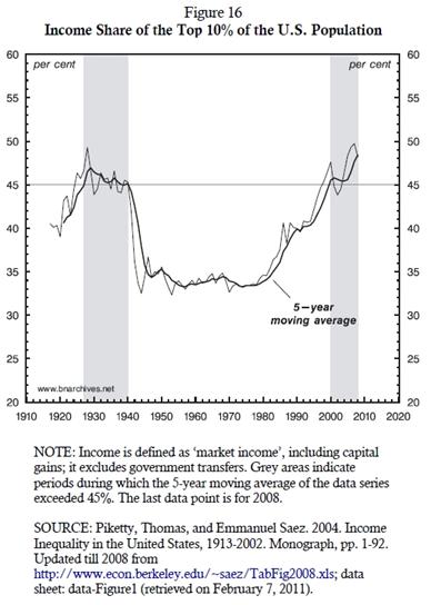
One important manifestation of the distributional processes we have explored today is illustrated in Figure 16. The figure shows the income share of the top 10 per cent of the U.S. population (note that, unlike the income share of corporate profit that focuses on organizations, this measure focuses on individuals). The shaded areas denote two historical extremes, periods in which the income share of the top 10 per cent of the population exceeded 45 per cent.
During the 1930s and 1940s, this level proved to be the asymptote of capitalist power: it triggered a systemic crisis, the complete creordering of the U.S. political economy, and a sharp decline in capitalist power, as indicated by the large drop in inequality. The present situation is remarkably similar – and, in our view, so are the challenges to the ruling class.
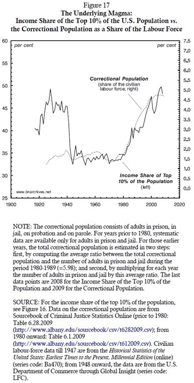
In order to have reached the peak level of power it currently enjoys, the ruling class has had to inflict growing threats, sabotage and pain on the underlying population. One key manifestation of this infliction is illustrated in our last chart, Figure 17.
The chart reproduces the distributional measure from Figure 16 (left scale) and contrasts it with the ratio between the adult correctional population and the labour force (right scale). The correctional population here includes the number of adults in prison, in jail, on probation and on parole.
As we can see, since the 1940s this ratio has been tightly and positively correlated with the distributional power of the ruling class: the greater the power indicated by the income share of the top 10 per cent of the population, the larger the dose of violence proxied by the correctional population. Presently, the number of ‘corrected’ adults is equivalent to nearly 5 per cent of the U.S. labour force. This is the largest proportion in the world, as well as in the history of the United States.
Although there are no hard and fast rules here, it is doubtful that this massive punishment can be increased much further without highly destabilizing consequences. With the underlying magma visibly shifting, the shadow of the asymptote cannot be clearer.
Appendix: Proxies of Dominant Capital
This transcript uses a proxy for dominant capital that is different from the one presented at the conference. The measure used at the conference was the ‘Compustat 500’, an aggregate comprising the top 500 firms listed in the Compustat North America dataset, ranked by market capitalization. In the present transcript, we use the Top 0.01%, an alternative measure comprising the top 0.01 per cent of firms listed and incorporated in the United States. The firms in the latter aggregate are cropped from the Compustat North America dataset by selecting from the database the top U.S.-incorporated firms, ranked by market capitalization.
The Compustat 500 differs from the Top 0.01% in two respects. First, whereas the Top 0.01% includes firms that are both listed and incorporated in the United States, the Compustat 500 includes U.S.-listed firms, regardless of where they are incorporated. Second, the number of firms included in the Top 0.01% has grown over time – from 271 in 1950 to 604 in 2010, in tandem with the total number of firms, which rose from 2.71 million to 6.04 million during the same period; by contrast, the number of firms in the Compustat 500 has remained constant at 500.
Note that, because we draw our data from the Compustat database, both measures of dominant capital include U.S.-listed firms only. They exclude unlisted U.S. firms (some of which are very large), as well as firms that are incorporated in the United States but listed elsewhere.
It is hard to determine which of the two measures is more appropriate for our purpose here.[21] In the end, we have preferred the Top 0.01%, for two reasons. First, the corporate universe is constantly growing, so it is not unreasonable to argue that the number of dominant capital firms is better approximated not by a fixed number of corporations (for example, at 500), but rather by a fixed proportion of the total number of corporations (we chose the proportion of 0.01%).
Second, the inclusion in the Compustat 500 of firms listed in the United States but incorporated elsewhere presents us with a practical and conceptual difficulty. In our work here, we compare the profit of dominant capital to the national income of the United States – yet the ‘nationality’ of the Compustat 500 proxy of dominant capital isn’t entirely clear. As it stands, we don’t know how much of the equity of foreign-incorporated Compustat 500 firms is owned by U.S. nationals; and that ignorance means that we don’t know what proportion of these firms’ profit is (or should be) included in U.S. national income. By including the entire profit of these firms in our measure of U.S. dominant capital, we overstate the ostensible ‘U.S.’ size of that group by an unknown amount equal to these firms’ foreign-owned profit. To sidestep this difficulty, we have limited our Top 0.01% group to U.S.-incorporated firms only (although we should note that ignoring the foreign ownership of U.S.-incorporated firms introduces a similar overstatement, equivalent to the portion of their profits that goes to foreign nationals. . .).
This, though, is a makeshift solution. Domestically listed ‘foreign’ firms per se are not a new phenomenon. But now that they have become so common, it is no longer clear how they should be separated from ‘domestic’ firms, or what that separation actually means. In 1950, foreign-incorporated firms constituted a mere 4 per cent of the Compustat 500, and although by 1980 this proportion had already risen to 14 per cent, the resulting inaccuracy was still tolerable. At the time, most foreign-incorporated firms were majority owned in their country of incorporation, and they used their U.S. listing primarily as a platform for raising minority capital. In that context, one could still treat the Compustat 500 as reasonable proxy for ‘U.S.’ dominant capital.
But that was the watershed. By 1990, with neoliberal globalization in full swing, foreign-incorporated firms already constituted 26 per cent of the Compustat 500 total. And as the ownership and operations of the world’s largest corporations became increasingly transnational, this share rose to 41 per cent in 2000, and 48 per cent in 2010. These transformations mean that, today, the top firms in the Compustat universe represent not U.S. dominant capital, but an important segment of global dominant capital. This is a foundational shift, and, as such, it calls for a new system of global accounting to match the globalizing nature of capital as power.
Endnotes
[1] Shimshon Bichler teaches political economy at colleges and universities in Israel. Jonathan Nitzan teaches political economy at York University in Toronto. All of their publications are available from The Bichler & Nitzan Archives (bnarchives.net). The present text contains several revisions to the empirical findings presented by Nitzan at the 2011 conference. The overall structure and conclusions remain unchanged.
[2] Our research on systemic fear was first articulated in Nitzan and Bichler (2009b) and Bichler and Nitzan (2010b), and it was later elaborated on in Kliman, Bichler and Nitzan (2011). For our earlier analyses of the crisis, see Bichler and Nitzan (2008; 2009).
[3] On modes of power in general and the capitalist mode of power in particular, see Nitzan and Bichler (2009a: Ch. 13).
[4] Succinct presentations of this framework are given in Bichler and Nitzan (2011; 2012 forthcoming). For a more detailed accounted, see Nitzan and Bichler (2009a).
[5] This interplay is by no means universal. In certain modes of power – the Megamachines of the ancient river deltas, Marx’s ‘oriental despotism’, or Orwell’s 1984 – the threat and exercise of force are so extreme that their subjects gradually lose the ability to even contemplate resistance, let alone organize it. The Indian caste system, for instance, has been welded over millennia by a power akin to the ‘strong force’ in the atom. There is enormous pent-up energy in that system; but once this energy has been locked in, turning it against the regime can only be achieved through a chain reaction triggered by a critical social mass.
There is no reason to assume that capitalism is immune from such a fate. It is certainly possible, at least logically, for capitalist power to eventually trump, crush and totally eliminate the opposition it elicits – in a manner anticipated by Jack London’s Iron Heel (1907). But this elimination would create a new mode of power altogether: having destroyed the will of its subjects, the new regime could no longer rely on the open buying and selling of commodified power; without vendible power, capitalization would cease; and without capitalization, the mode of power could no longer be called ‘capitalistic’ – at least not in the present sense of the term.
[6] On the Kepler watershed and its importance for science in general and the concept of force in particular, see Jammer (1957: Ch. 5).
[7] For a critical history of capitalization and its rituals, see Nitzan and Bichler (2009a: Part III).
[8] See the Appendix for a brief methodological discussion of alternative measures of dominant capital.
[9] National income can be measured at market prices (inclusive of indirect taxes less subsidies), or at factor cost (exclusive of indirect taxes less subsidies). This article uses the former, more comprehensive, measure.
[10] Although debt can be considered a ‘negative’ asset, a debtor cannot own less than nothing. The net debt of a debtor (liabilities less assets) is a claim on the debtor’s future income. As long as the present value of this future income is greater than or equal to the debtor’s net debt, the debtor’s assets are non-negative. If the present value of the future income is smaller than the net debt, the debtor is technically bankrupt, having zero assets.
[11] A log scale, shown here in multiples of 10, is a convenient way of plotting series that change exponentially.
[12] The guideline here is very rudimentary and by no means exhaustive. Needless to say, it does not preclude different and/or more detailed analyses of power.
[13] Our emphasis here is on the long-term trends of the two series. The cyclical oscillations tend to correlate with the business cycle. To illustrate, consider the downswing since 2008. Falling employment during that period has caused the ratio of employees to the adult population (top series) to fall, while rising unemployment has made national income per adult fall faster than compensation per employee, causing the bottom series to rise. The same logic, only in reverse, operates during an upswing.
[14] The national income accounts provide two measures of profit – with and without capital consumption adjustment (CCAdj) and inventory valuation adjustment (IVA). In this paper we use the former measure (without CCAdj and IVA), because its definition is closer to the one used by corporations. The quantitative difference between the two measures is negligible for our purposes here.
[15] Note that a proprietorship can comprise more than one person.
[16] In practice, different debts carry different rates of interest over different maturities, while our computation here uses a single rate of interest for an average long-term maturity. This discrepancy makes the imputed debt inaccurate to some extent, but the general trend is probably not too far off.
[17] On the difficulties associated with foreign asset and income data, see for example Griever, Lee and Warnock (2001), Bosworth, Collins and Chodorow-Reich (2007) and Curcuru, Dvorak and Warnock (2008). On the extensive use of tax havens by large U.S.-based firms and the accounting uncertainties caused by this use, see White (2008).
[18] ROW profits are, by definition, part of U.S. national income (although not of domestic income), so regardless of how large they become, they can never cause overall profit to exceed national income.
[19] See Bichler and Nitzan (2010a: 19, Figure 3). These data pertain to listed corporations only. Insofar as the proportion of foreign firms listed in the United States (in terms of both numbers and profit) is larger than the comparable global average, and if this differential has risen over the past half century, the numbers we report here could very well overstate the profit share of U.S.-based firms while understating the pace of its temporal decline.
[20] Whereas national net profit is earned by U.S. nationals regardless of the geographic territory in which they are generated, domestic net profit is earned on U.S. territory, regardless of the nationality of the owner.
[21] The definition and boundaries of dominant capital are always arbitrary to some extent. We have discussed some of the difficulties associated with this arbitrariness in a number of our works (see for example, Nitzan and Bichler 2009a: Ch. 14), but the attendant issues deserve a fuller theoretical, methodological and empirical inquiry.
References
Bichler, Shimshon, and Jonathan Nitzan. 1996. Putting the State In Its Place: US Foreign Policy and Differential Accumulation in Middle-East "Energy Conflicts". Review of International Political Economy 3 (4): 608-661.
Bichler, Shimshon, and Jonathan Nitzan. 2008. Contours of Crisis: Plus ça change, plus c'est pareil? Dollars & Sense, December 29.
Bichler, Shimshon, and Jonathan Nitzan. 2009. Contours of Crisis II: Fiction and Reality. Dollars & Sense, April 28.
Bichler, Shimshon, and Jonathan Nitzan. 2010a. Imperialism and Financialism. A Story of a Nexus (Revised and Expanded). Monograph, Jerusalem and Montreal (September), pp. 1-29.
Bichler, Shimshon, and Jonathan Nitzan. 2010b. Systemic Fear, Modern Finance and the Future of Capitalism. Monograph, Jerusalem and Montreal (July), pp. 1-42.
Bichler, Shimshon, and Jonathan Nitzan. 2011. Differential Accumulation. Monograph, Jerusalem and Montreal (December), pp. 1-13.
Bichler, Shimshon, and Jonathan Nitzan. 2012 forthcoming. Capital as Power: Toward a New Cosmology of Capitalism. In Global Political Economy. Contemporary Theories, edited by R. Palan. New York and London: Routledge.
Bosworth, Barry , Susan M. Collins, and Gabriel Chodorow-Reich. 2007. Returns on FDI: Does the U.S. Really Do Better? No. 13313. NBER Working Paper Series (August).
Curcuru, Stephanie E. , Tomas Dvorak, and Francis E. Warnock. 2008. Cross-Border Returns Differentials. No. 13768. NBER Working Paper Series (February).
Griever, William L., Gary A. Lee, and Francis E. Warnock. 2001. The U.S. System for Measuring Cross-Border Investment in Securities: A Primer with a Discussion of Recent Developments. Federal Reserve Bullein (October): 634-650.
Jammer, Max. 1957. Concepts of Force. A Study in the Foundations of Dynamics. Cambridge: Harvard University Press.
Kliman, Andrew, Shimshon Bichler, and Jonathan Nitzan. 2011. Systemic Crisis, Systemic Fear: An Exchange. Special Issue on 'Crisis'. Journal of Critical Globalization Studies (4, April): 61-118.
London, Jack. 1907. [1957]. The Iron Heel. New York: Hill and Wang.
Nitzan, Jonathan. 2001. Regimes of Differential Accumulation: Mergers, Stagflation and the Logic of Globalization. Review of International Political Economy 8 (2): 226-274.
Nitzan, Jonathan, and Shimshon Bichler. 1995. Bringing Capital Accumulation Back In: The Weapondollar-Petrodollar Coalition -- Military Contractors, Oil Companies and Middle-East "Energy Conflicts". Review of International Political Economy 2 (3): 446-515.
Nitzan, Jonathan, and Shimshon Bichler. 2001. Going Global: Differential Accumulation and the Great U-turn in South Africa and Israel. Review of Radical Political Economics 33: 21-55.
Nitzan, Jonathan, and Shimshon Bichler. 2009a. Capital as Power. A Study of Order and Creorder. RIPE Series in Global Political Economy. New York and London: Routledge.
Nitzan, Jonathan, and Shimshon Bichler. 2009b. Contours of Crisis III: Systemic Fear and Forward-Looking Finance. Dollars & Sense, June 12.
White, James R. 2008. International Taxation. Large U.S. Corporations and Federal Contractors with Subsidiaries in Jurisdictions Listed as Tax Havens or Financial Privacy Jurisdiction. Washington D.C.: United States Government Accountability Office.
